Micro-Tip pruner
This tool is used for detail trimming often associated with delicate flowering plants. The colors and wispy nature of the illustration convey a pleasant, natural interaction.

This tool is used for detail trimming often associated with delicate flowering plants. The colors and wispy nature of the illustration convey a pleasant, natural interaction.
The long handles of this tool are meant to reach into thorny plants for pruning while protecting the gardener. Thorns were intentionally left out of the illustration as they pose no harm, as if they weren't even there to begin with.
The long and curvy green stems appear slightly overgrown and the tool is positioned to begin trimming.
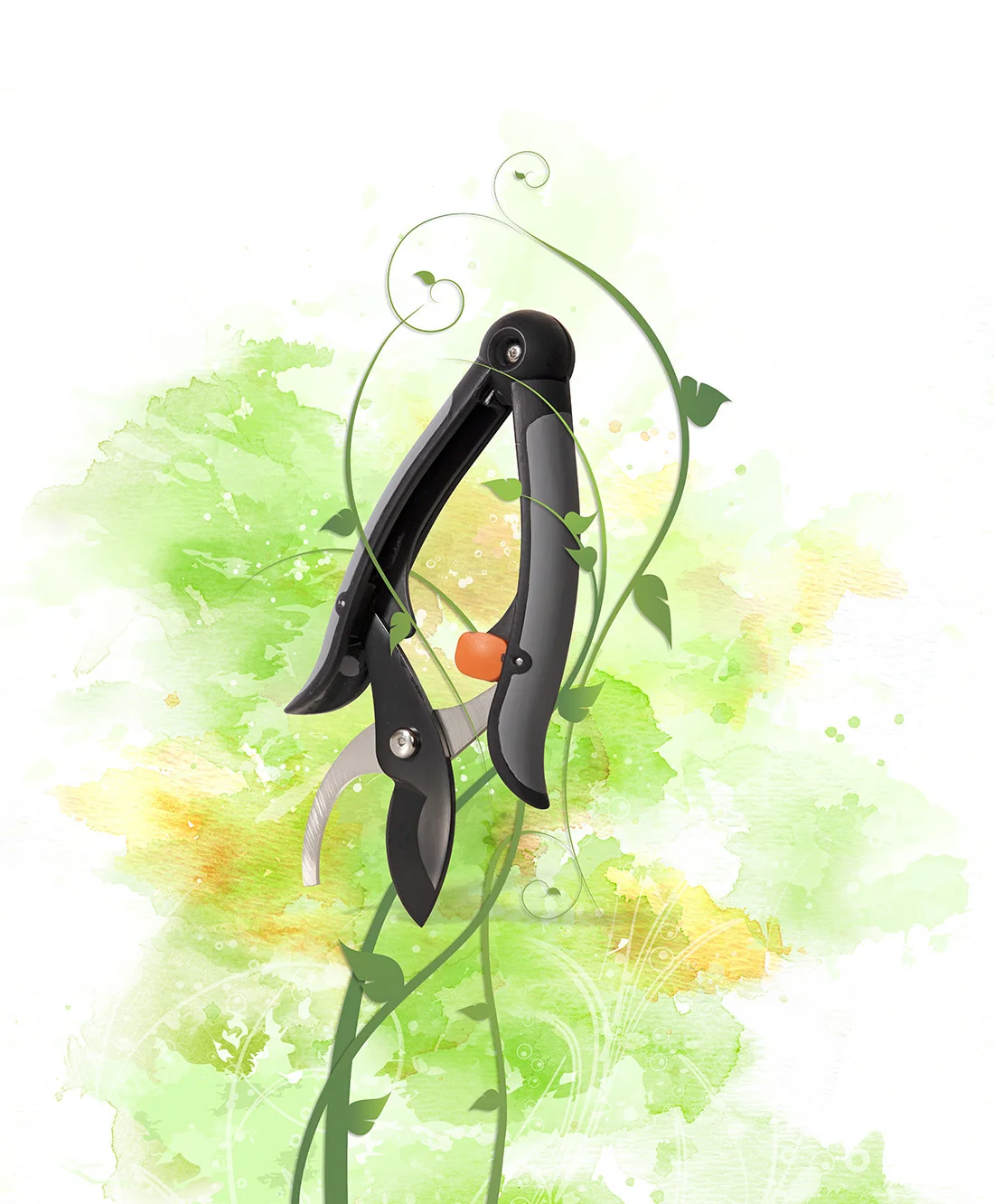
Thick and thin vines represent the range of stems this general purpose pruner is designed to handle.
This example shows how the inspiration theme was adapted for a popular butterfly hatching event at Olbrich Gardens, Madison, WI. Fiskars provided free tools for new garden club members at this event.
Six free-standing vertical signs were created for use at trade and consumer shows.
Finally, the series was also used for print and digital ads. This example is a full-page ad introducing a Fiskars new product launch available exclusively to independent garden centers.
This logo represents propellers designed for tournament style fishing boats. American Advertising Federation product trademark winner.
Originally designed for an independent startup, this product became so successful it has been sold and is now marketed by Platex Products, Inc.
Along with this logo design I wrote the "Bring Home The Bacon" statement. Another highly successful startup company, Marburger was purchased by ConAgra Foods, Inc.
Created for a small financial services company that sold credit card data transmission machines.
An upscale restaurant in Beloit, WI.
Watering products sub-brand of Fiskars.
A previous generation logo for which I hand-lettered the font (digitally) and also authored the Global Graphic Standards.
Company logo developed for Sue Kaestner and Naomi Bodway, a "Widget" marketing company that has now evolved into The Widget Source.
A Peterbuilt truck dealer with many locations. This base logo has been adapted to various services and programs offered.
A design-build & construction company in Madison, WI.
Best in show and two gold awards for retail packaging.
Retail package and merchandising series co-branding project. There were three products in the line and all sold well at retail. Arnold personally signed off on all designs before production began.
Endcap aisle display pre-production rendering with header card in place.
Free-standing corrugate display pre-production rendering.
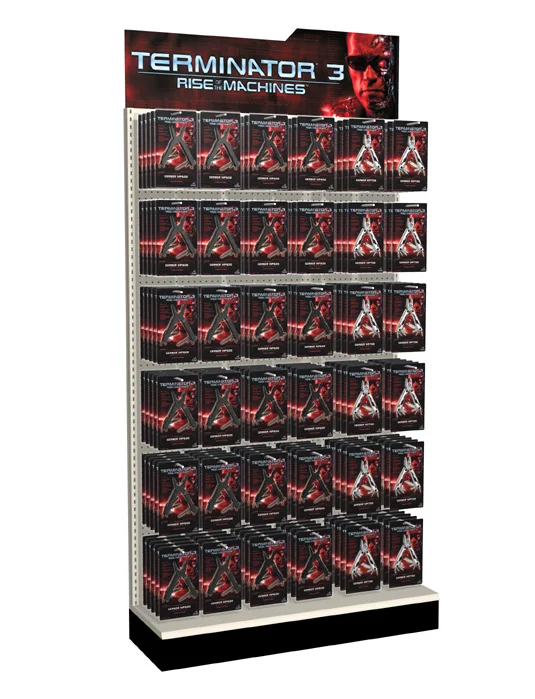
Large format display banners used for trade and consumer show launch of the T3 Multi-Tool series of products.
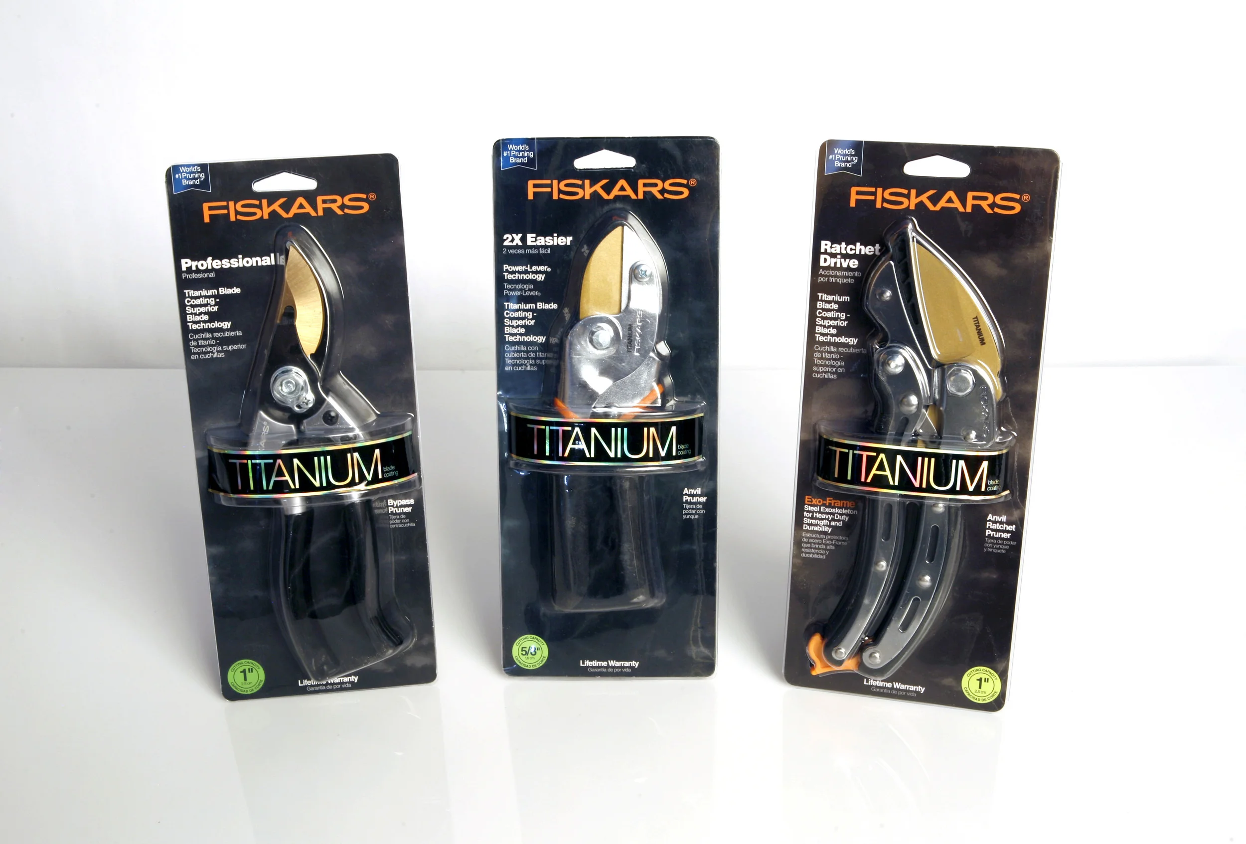
Primary package series and NRHA Gold winner for Fiskars pruning tools. This series was designed as part of a larger more comprehensive approach to merchandising all Fiskars products at The Home Depot, USA and Canada.
An entirely new concept for merchandising all Fiskars garden products to provide the consumer with a clear trade-up story and also increase multiple purchases based on seasonal activities. This concept is in live store trials now, and has achieved a lower cost for packaging and a lift in overall sales vs the previous shelved merchandising method. This initiative was instrumental in securing a three-year exclusive contract with THD for 40 products.
Structural and graphic design series concepts for Winchester lighting products.
Actual production sample of Fiskars garden hose primary retail packaging. A unified graphic style was carried across the entire product line.
Actual production sample of a Fiskars cutting tool promotional item. All promotional packaging maintained the brand identity while also featuring the unique selling proposition of the product.
Conceptual display of interactive animal calls for Wal-Mart.
Dan Schiro, a friend and talented writer who I had the pleasure of collaborating with on many projects. Dan is shown here with his "writer's block breaker", an e-cigarette.
An engineer who developed the Fiskars StaySharp reel mowers. The shadow cast in the background is from the actual mower David designed.
An incredibly smart and personable individual. The product shadow is a lopper which is a large 2-handle branch pruner.
He really goes by Ted, not Theo. But Theo fit the layout better so I took a little creative license. But Ted is great a great guy.
Sitting on the capitol steps at two years of age, this little guy appears ready to start his path to the top office of the state.
Hiking on the way to Emerald Lake.
A simple yet elegantly structured scene I noticed on my way home one evening in Wisconsin.
Hand-held shot taken from my hotel window in Chicago. The view is of the East river as it heads into lake Michigan.
A low depth of field image taken to show the embossing effect of a Fiskars paper crafting product.
A product with challenging light, dark, and reflective materials.
This image shows the internal mechanics of a centrifugal pump. As the interior area required more intense lighting to capture the details, two shots of different exposures were taken and merged together for the final result.
A hand-held shot with ambient tungsten lighting. No retouching or color correcting has been done to this image.
A hand-held shot with ambient tungsten lighting.
The business end of a reel mower. This image is a composition of three exposures to maintain details and eliminate reflections.
A hand-held shot with ambient tungsten lighting. No retouching or color correcting has been done to this image.
This concept appeared as a stark contrast to competitors in a highly scientific field. I wrote and designed this ad, which is one of a series in a campaign that proved to be very successful for the client.
This two page spread ad concept challenged the reader to make sense of the copy, which would be correct if read left to right, top to bottom. When the message "clicked" with the reader, it provided a strong reinforcement to the selling point.
Trade ad for new product launch exclusively to independent garden centers.
When the National Hardware Show was in Chicago at McCormick Place, it was the largest trade show in the world. Here is the largest sign ever made at the show. The flags hanging below the brand sign represent each country with a Fiskars Brands location.
This booth space was so vast it was impossible to capture in a single photo.
One of the brand corners of the booth for the Garden division. The six signs show the major product categories of the division
The main pottery area. The top sign maintains the design grid, with a single message unique to the category.
BucketBoss was a sub-brand of Fiskars. Again, the layout and single message maintains consistency with the other main categories of the larger booth.
Vertical banners located down the main aisle represented each division and sub-brand of Fiskars at the booth.
One example of a new watering product line, shown as if it were merchandised in an actual store planogram.
This 20' booth example toured the country and is shown here at the Madison Garden Show, Alliant Center. Simple branding and a category composite graphic panel provided a clean overall design which reflected Fiskar's Finnish heritage.
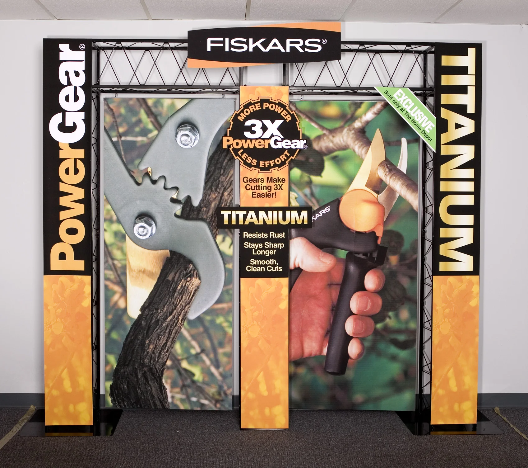
This 10' booth was designed for the introduction of the new "Titanium" version of Fiskar's premium PowerGear line of pruning tools. The product line gained an immediate exclusive with The Home Depot, and first years sales provided the foundation for back-to-back three year exclusive contracts with The Home Depot.
Gerber Legendary Blades is a division of Fiskars Brands Inc. This is the SHOT Show in Las Vegas, NV. Multi-tools along with knives and sporting goods are Gerber's main products.
Another view shown here. Notice the different logo on the main counter. This show was the launch of a brand identity update, which I also designed.